Mastering Webinar Analytics to Maximise Marketing ROI
Unlock the power of webinar analytics. Learn how to track the right metrics, prove value, and turn data into a high-impact B2B content strategy that drives ROI.
Webinar analytics offer a detailed, behind-the-scenes look into how your event performed, arming B2B marketing teams with the data to fine-tune their virtual event strategy. Think of it as a backstage pass to your audience's behaviour. It transforms abstract numbers into actionable intelligence, revealing precisely what engages your best prospects, fuels your content pipeline, and drives measurable business growth.
Why Webinar Analytics Are Your Secret Weapon
Let's be direct: proving the value of your webinar programme can feel like an uphill battle. You’re juggling limited resources, a constant demand for high-quality leads, and that persistent question from leadership: "What was the ROI on that?" Webinar analytics are your definitive answer, elevating the conversation far beyond simple attendance numbers and demonstrating clear business impact.
Instead of seeing it as a reporting chore, view analytics as your strategic intelligence tool—a direct line into your audience’s thinking. It’s like running a high-tech focus group with hundreds of high-value prospects at once. Powerful webinar analytics show you which topics genuinely resonate, which parts of your presentation command the most attention, and what questions are top-of-mind for potential customers. This is crucial for B2B SaaS teams needing to produce consistent, high-impact content.
From Data Points to Strategic Decisions
This data-driven approach allows you to systematically sharpen your content, shorten sales cycles, and demonstrate tangible business growth. For instance, noticing that a specific 5-minute segment of your on-demand webinar was re-watched multiple times by prospects from target accounts is a massive buying signal. That insight can directly inspire your next piece of follow-up content, like a detailed blog post or a short video clip on that exact topic. A single event suddenly becomes a perpetual demand-generation engine, solving the pain point of consistent content output.
And the numbers back this up. Data shows that B2B webinars achieve an average 30-40% attendance rate, with highly engaged audiences spending an average of 51 minutes in-session. For a SaaS company, this sustained attention is a golden opportunity.
By treating analytics as a continuous feedback loop, you stop guessing what your audience wants and start knowing. This shift is crucial for efficiency, allowing you to allocate limited resources to content and topics with proven traction, maximising the ROI of every event.
To implement this effectively, it helps to understand how the old way of looking at metrics stacks up against what's possible today. We're moving from just counting heads to understanding intent and behaviour.
The Shift from Vanity Metrics to Actionable Intelligence
| Traditional Metric (What You See) | Actionable Insight (What You Learn) |
|---|---|
| Total Registrants | Registration Source & Conversion Rate: Identifies which channels (email, LinkedIn, paid ads) drive the most valuable sign-ups, helping you optimise promotional spend. |
| Live Attendance Rate | Audience Drop-Off Points: Pinpoints the exact moments in your presentation where engagement dips, helping you refine future content and speaker delivery. |
| Questions Asked in Q&A | Thematic Analysis of Questions: Reveals the biggest pain points and interests of your most engaged prospects, directly feeding your content strategy for blogs and social media. |
| Poll Responses | Audience Segmentation: Groups attendees based on their answers (e.g., company size, biggest challenge), allowing for highly targeted and relevant follow-up campaigns. |
| On-Demand Views | Content Re-Watch & Heatmaps: Shows which specific sections of the replay are being viewed most, highlighting "hot spots" of interest that can be repurposed into micro-content. |
| Final Attendee List | CRM & MA Integration: Tracks which attendees are already in your pipeline and flags new, high-intent leads for immediate sales follow-up, accelerating the sales cycle. |
This table illustrates the leap from simply collecting numbers to interpreting them for strategic advantage. Every data point becomes a clue that helps you refine your approach, making each webinar more efficient and effective than the last.
Ultimately, a unified platform that simplifies everything from professional production to deep analysis is what makes this possible. As a strategic partner, Cloud Present helps you connect webinar engagement directly to pipeline contribution, turning your data into your most valuable asset. Mastering this process is fundamental to creating effective lead generation webinars that consistently deliver results. By harnessing these insights, you can move from simply hosting events to orchestrating powerful, client-engaging experiences that drive your business forward.
Decoding the Metrics That Actually Matter
Let’s be clear, not all data is created equal. It's easy to get distracted by high registration numbers, but experienced B2B marketers know the real story is buried much deeper. To determine what’s actually driving demand, you need to decode the specific webinar analytics that signal genuine interest and purchase intent. Think of it as turning raw numbers into a clear roadmap for efficient growth.
This visual map shows that exact journey, from messy data to real business growth—the core principle of any effective webinar analytics strategy.
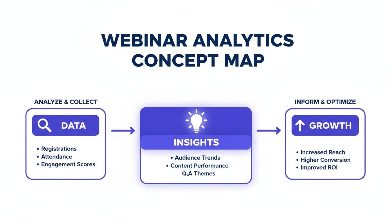
The key takeaway? Data is just the start. It’s the insights you extract and the actions you take that drive measurable success and prove ROI. Let’s break down the metrics that get you there.
Attendance and Drop-Off Rates
At first glance, attendance seems simple. But the real story is in the nuance. A benchmark attendance rate in the B2B SaaS world hovers around 30-40%, but this figure is highly contextual. A niche, bottom-of-funnel demo for 50 C-suite executives that achieves a 60% attendance rate is far more valuable than a 30% rate for a broad, top-of-funnel webinar with 500 registrants.
The drop-off rate is your content quality barometer. Did 40% of your audience leave during a complex technical explanation or a specific guest's segment? That isn't a failure; it's a critical insight. It tells you that section may have been too technical, too long, or poorly positioned for that audience.
Actionable Insight: Pinpoint the exact moments where attention fades. This data lets you refine future presentations, ensuring every minute of your next webinar is optimised to keep your high-value audience hooked. For example, if you see a drop-off during a product demo, you might need to make it more benefit-oriented next time.
Engagement Metrics
Engagement is where passive viewing turns into active interest. These metrics are the voice of your audience, telling you precisely what resonates and what sparks curiosity. A high engagement rate is a fantastic leading indicator of a quality, sales-ready lead.
Look beyond the surface numbers to find actionable ideas:
- Poll Responses: A poll asking, "What is your biggest challenge with data integration in 2025?" doesn't just engage the audience; it segments them by their primary pain points. This data allows you to create tailored follow-up email sequences and inspire your next blog series.
- Questions Asked: The Q&A is a content goldmine. If ten different attendees ask about integrating your software with a specific platform like Salesforce, that’s a clear signal to create a dedicated guide, FAQ page, or even a short video addressing that exact topic.
- Chat Participation: A lively chat indicates a connected and interested audience. Analysing the sentiment and topics can reveal key themes and common objections that your sales team needs to be prepared to address.
Conversion Metrics
This is where your webinar analytics connect directly to ROI. Conversion metrics track the specific, bottom-of-the-funnel actions that signal strong buying intent and contribute directly to your sales pipeline. These are the numbers that get your leadership team’s attention.
Focus on tracking high-value actions taken during or immediately after the webinar:
- "Book a Consultation" Clicks: This is the most direct indicator of a sales-ready lead. Making this Call-To-Action (CTA) clear and easy to click within your webinar platform is non-negotiable for demand generation.
- Demo Requests: A clear sign that an attendee wants to see how your SaaS solution fits their specific use case.
- Gated Asset Downloads: When someone downloads a pricing guide or a detailed case study offered during the webinar, they are effectively qualifying themselves as a serious prospect.
Tracking these conversions helps prove the commercial value of your webinar programme, justifying future investment and demonstrating your team's impact on the bottom line. To get a handle on the metrics that matter, it's worth exploring broader, more fundamental strategies to analyze content performance.
Content Consumption Data
The life of a webinar stretches far beyond the live event. Your on-demand content is a long-term asset, and how people consume it provides powerful clues about their intent. Don't just track total views; dive deeper.
For instance, if your analytics show a prospect from a target account has re-watched the "Pricing & ROI" chapter of your on-demand webinar three times, that’s a massive buying signal. This is data your sales team can act on immediately, enabling a timely and highly relevant conversation. Similarly, tracking which downloadable resources (like slides or white papers) are accessed most often after the event helps you understand which supporting content adds the most value and should be promoted further.
Building Your Webinar Analytics Dashboard
A powerful webinar programme needs a central command centre. Your webinar platform generates useful data, but its true potential is only unlocked when it flows seamlessly into the systems your teams use every day, like Salesforce or HubSpot. This integration creates a single source of truth, turning fragmented metrics into a unified, actionable view of your customer journey.
The goal is to eliminate manual reporting. Instead, you'll build a dynamic dashboard that feeds real-time insights straight to your marketing and sales teams. This isn’t just about efficiency gains; it’s about making faster, smarter decisions that have a direct impact on revenue. By connecting your systems, you automate the administrative work and empower your teams with the information they need to act decisively.
Integrating Platforms for a Unified View
Connecting your webinar platform to your CRM is step one. This process involves mapping specific engagement data points—like poll answers or questions asked—to custom fields within your customer records. Suddenly, your contact profiles are enriched with valuable behavioural data, transforming your CRM from a simple database into a dynamic intelligence hub.
Implementation steps:
- Map Key Data Points: Identify the crucial signals you want to capture, such as
Attendance Status(Live, No-show, On-demand),Engagement Score,Questions Asked, andPoll Responses. - Create Custom Fields in CRM: Set up corresponding fields in your CRM (e.g., 'Last Webinar Attended', 'Webinar Engagement Level').
- Automate Data Sync: Use native integrations or a tool like Zapier to ensure data flows automatically from the webinar platform to the CRM in real-time.
Mapping these data points supercharges your lead scoring. A lead who attended live and asked a product-specific question should automatically receive a higher score than someone who only registered. This simple automation ensures your sales team is always focused on the warmest, most engaged leads first, improving their efficiency and shortening the sales cycle. You can learn more about optimising your sign-up process with our Registration Analyzer tool.
This diagram shows how the data should flow from your webinar platform, through your CRM, and into a cohesive analytics dashboard that marketing and sales can use.
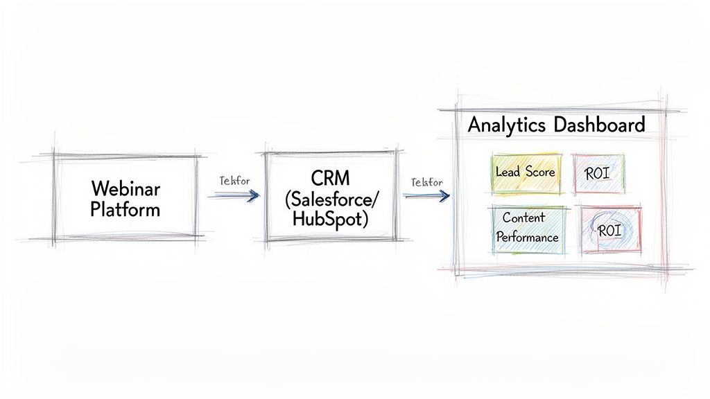
This setup ensures every team sees the same consistent, up-to-date information. No more data silos. Just better alignment and faster revenue generation.
Designing Your Dashboard for Actionable Insights
With your data flowing freely, it's time to visualise it. A good dashboard tells a clear story, highlighting the metrics that directly impact your business goals. Ditch vanity metrics and focus on widgets that track lead progression, content performance, and the overall ROI of your programme.
Here are the essential components of a high-performance webinar analytics dashboard for a B2B SaaS team:
- Lead Generation & Pipeline Influence: This widget must track how many new leads, Marketing Qualified Leads (MQLs), and Sales Qualified Leads (SQLs) each webinar generated. Crucially, it should also show the total pipeline value (in US Dollars) attributed to your webinar programme.
- Engagement Over Time: A line graph showing audience retention is a must-have. It visually pinpoints exactly where engagement peaks and where it drops off, giving you brutally honest feedback on your content's pacing and relevance, helping improve future webinar production.
- On-Demand Performance & Content Repurposing: Don't forget the long-tail value. A dedicated section should track on-demand views, engagement, and conversions over time. For example, tracking which on-demand clips generate the most leads can inform your content repurposing strategy for months to come.
By building a dashboard that focuses on these core areas, you create more than a report—you create a strategic tool. It becomes the command centre for your entire virtual event strategy, enabling your team to prove value and refine their approach with confidence.
Turning Webinar Data Into a Content Goldmine
Your webinar analytics are more than just numbers on a dashboard; they’re a blueprint for your next month of content. For B2B SaaS marketing teams, the pressure to consistently create high-quality content is relentless. This is where you can work smarter, not harder. By treating your webinar data as a direct feedback loop from your audience, you can turn a single event into a perpetual content engine, solving a major pain point for resource-strapped teams.
This isn’t just about reporting on what happened. It's about taking what you've learned and strategically repurposing it into blog posts, social media updates, and sales enablement assets that you know your audience already cares about. It’s the ultimate way to maximise the ROI on every minute you invested in webinar production.
Uncovering Content Ideas in the Q&A
The Q&A session is often the most valuable part of any webinar. It's a live focus group where your most interested prospects tell you exactly what’s on their minds—their pain points, their technical questions, and the barriers holding them back from a purchase. Don't let that goldmine of insight disappear the moment the webinar ends.
Imagine your last webinar on a new software feature generated 15 specific questions about API integration and data security. Each of those questions is a ready-made topic for a piece of content. This isn't guesswork. It's a data-backed strategy that guarantees your content will be relevant and will address genuine customer needs.
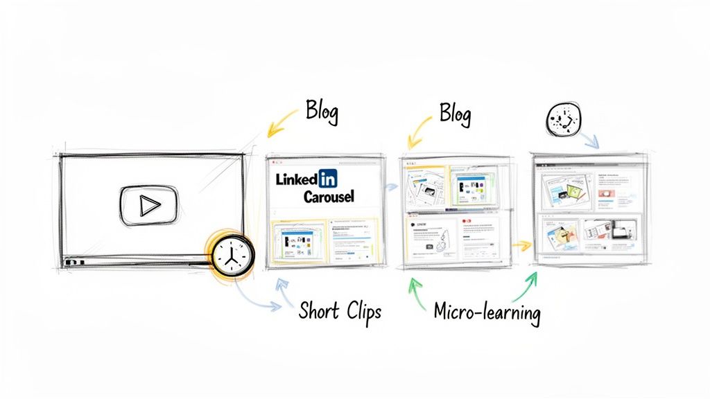
From Questions to a Multi-Channel Campaign
So, how do you turn those Q&A nuggets into a full-blown content campaign? Here’s a practical framework that shows how one webinar can fuel your marketing calendar for weeks, improving efficiency.
- The Blog Series: Group similar questions. If three people asked about data compliance, that’s your cue to write a deep-dive blog post titled, "Everything B2B SaaS Buyers Need to Know About Data Security in Our Platform."
- The LinkedIn Carousel: Extract the key takeaways from that blog post and design a sharp, visual carousel. Each slide can tackle one of the original audience questions, delivering a concise, shareable answer.
- Short-Form Video Clips: Use your webinar recording to snip several 60-second clips. Each one should feature your expert directly answering a top question from the Q&A—perfect for sharing on social media to extend the webinar's reach.
- The FAQ Page Update: Take the most common questions and add polished, comprehensive answers to your website’s FAQ or knowledge base. This helps prospects and gives your SEO a valuable boost.
With this approach, those 15 questions can easily become more than ten distinct content assets. If you want to see this process broken down even further, check out our guide on webinar content repurposing to turn one session into 10 marketing assets.
Using Engagement Data to Create Micro-Learning
Beyond the Q&A, your average view time and content consumption data offer another layer of powerful insight. Let’s say your analytics show an impressive 51-minute average view duration. The next question is, which parts of the presentation kept them hooked?
By analysing audience retention graphs, you can pinpoint the most re-watched or "stickiest" segments of your webinar. These are your proven high-value moments.
This is your opportunity to create targeted, on-demand micro-learning assets. If you see a five-minute section explaining a complex regulatory change was watched repeatedly, extract it. Package that segment as a standalone, bite-sized video. From there, you can use it in a few ways:
- As a Gated Lead Magnet: Place the video behind a form on a landing page to capture new leads interested in that specific topic.
- For Sales Enablement: Arm your sales team with the clip so they can send it to prospects who bring up similar questions on calls.
- In Nurture Campaigns: Weave the video into an email sequence to educate leads and guide them further down the funnel.
Webinar analytics often show that events generate numerous interactions per attendee, providing a rich source of first-party data. By digging into these specific queries, marketing teams can pinpoint what clients truly need and refine their content strategy accordingly. This data-driven approach ensures every piece of content you create from your webinar is pre-validated by your audience's own behaviour.
How to Measure Webinar ROI and Prove Its Value
Your webinar analytics dashboard is humming with data. That's great, but leadership doesn't care about engagement scores. They want to see the one thing every marketer must prove: return on investment.
This is your moment to connect your team's hard work directly to commercial impact. It’s time to shift the conversation from metrics to money. You need a story backed by simple, clear formulas that speak the language of business: pipeline, revenue, and cost-efficiency. This is how you build a compelling case that not only champions your team's success but also secures the budget for your next virtual event series.
Calculating Your Core Financial Metrics
To prove your webinar programme is a growth engine, you need to translate audience engagement into US Dollars. Two of the most powerful metrics for this are Cost Per Lead (CPL) and Return on Investment (ROI).
First, get a handle on your total webinar cost. Be thorough.
- Platform Fees: The subscription cost for your webinar software.
- Speaker Costs: Any fees for guest experts or industry influencers.
- Promotional Spend: The budget for paid social ads, search campaigns, or sponsored emails.
- Team Time: Calculate an estimated cost for the hours your team invested in planning, professional production, and promotion.
Once you have that total figure, the calculations are straightforward.
1. Cost Per Lead (CPL) This tells you exactly how much it costs to acquire a new lead via your webinar, making it a fantastic metric for comparing channel efficiency.
Formula: CPL = Total Webinar Cost / Total Number of Leads Generated
Example: Let's say your webinar cost $5,000 all-in and you generated 100 new MQLs. Your CPL is a highly efficient $50. Now you can confidently state that your webinars are a more cost-effective source of leads than a trade show that costs ten times as much.
2. Return on Investment (ROI) This is the ultimate measure of profitability, showing the revenue generated for every dollar spent.
Formula: ROI (%) = [(Revenue Attributed to Webinar - Total Webinar Cost) / Total Webinar Cost] x 100
Example: If that same $5,000 webinar influenced $50,000 in closed-won deals down the line, your ROI is an incredible 900%. That's not just a good number; it's a budget-defending, strategy-validating triumph.
Attributing Revenue in a Complex Journey
Calculating ROI is simple when a lead attends a webinar and immediately buys. But the B2B SaaS customer journey is rarely that clean-cut. It's a winding road, not a straight line.
This is where multi-touch attribution becomes your best friend. It helps you accurately credit webinars for the role they play within a much longer sales cycle.
Instead of an all-or-nothing approach where only the last touchpoint gets the credit, multi-touch models assign partial credit to the various interactions a prospect has with your brand. They might discover you through a blog post, attend your webinar, download a whitepaper, and then finally request a demo. In a linear attribution model, your webinar would rightly receive 25% of the credit for that deal.
To make this work, you must integrate your webinar platform with your CRM. This lets you track these journeys automatically and build reports that show how webinars influence deals over time, even when they aren't the final click. To truly master this, it helps to understand broader marketing and branding strategies for video success.
Building a C-Suite Ready Performance Report
Your final step is to package this data into a story that resonates with the C-suite. Ditch the granular engagement stats—they don't need to know the drop-off rate at the 27-minute mark. Focus on the big picture.
Structure your report to tell a clear story of business impact:
- Executive Summary: Lead with the headline figures. Start strong with, "Our Q3 webinar series generated $250,000 in attributed pipeline with a 900% ROI."
- Lead Generation & Pipeline Impact: Show the number of MQLs and SQLs generated. Most importantly, highlight the total value of the sales pipeline influenced by your webinar programme.
- Cost Efficiency: Put your CPL front and centre. Compare it to other channels like paid search or industry events to demonstrate the efficiency of your strategy.
- Strategic Insights & Next Steps: Briefly explain what you learned. What content formats worked? Which topics resonated? Then, outline how you'll use those insights to make the next webinar series even more profitable.
When you frame your webinar performance in the language of revenue, pipeline, and ROI, you transform your programme from a 'nice-to-have' marketing activity into a proven engine for business growth. This is how you empower your team, justify your budget, and earn your seat at the strategic table.
Common Questions About Webinar Analytics
Even the sharpest virtual event strategy runs into questions once the data starts rolling in. Getting clear, actionable answers is what separates a good webinar programme from a great one. This is your strategic guide to the most common questions we hear from B2B SaaS marketing professionals.
We'll cut through the noise and provide practical advice to help you fine-tune your approach and prove your impact.
What Is the Most Important Metric in Webinar Analytics?
This is the big one, and the honest answer is: it depends on your goal. But if you’re reporting to the C-suite, the metric that speaks loudest is almost always Pipeline Influence or Marketing-Attributed Revenue. It’s the number that ties your webinar directly to sales opportunities and, ultimately, revenue.
That said, for your day-to-day content and webinar production strategy, other metrics are far more useful. Two of the most powerful leading indicators are Audience Retention Rate and Engagement Score.
A high retention rate—say, 75% of your audience staying until the very end—is a massive signal that your content is hitting the mark. Pair that with a high engagement score (think lots of smart questions and active poll participation), and you’ve got a proven recipe for generating educated, high-quality leads.
How Can I Improve My Webinar Attendance Rate?
Boosting your live attendance is a game of anticipation and value. While the industry average for B2B events hovers between 30-40%, you can nudge that number higher with a smart promotional strategy that starts weeks before you go live.
Focus your energy on three key implementation steps:
- Nail Your Promotion Cadence: Don’t just send one email. Start promoting two to three weeks out. Build momentum with reminders: one week before, the day before, and a final nudge an hour before showtime. Data shows that 29% of registrations happen on the day of the event.
- Craft a Can't-Miss Value Proposition: Your registration page has one job: answer the visitor's question, "What specific problem will this solve for me?" Be crystal clear about the tangible insights, skills, or data they’ll gain.
- Engage Registrants Before the Event: The conversation starts the moment they sign up. Send teaser content, introduce your speakers on LinkedIn, or invite them to submit questions in advance. This builds a sense of community and makes them feel invested before the webinar even begins.
And don't forget to look at your own data. Your analytics will show you which days and times consistently pull in the biggest crowds for your specific audience.
What Is a Good Benchmark for Webinar Engagement?
In a B2B setting, strong engagement is about quality, not just quantity. A solid benchmark to aim for is an average viewing time of at least 70% of your webinar's total length. For a 60-minute webinar, that means your average attendee is tuned in for a solid 42 minutes.
A great baseline for interactions is around 1.5 to 2.0 per attendee. This shouldn’t be a single action, but a healthy mix of poll responses, insightful Q&A questions, and downloads of any resources you offer.
If you can get more than 25% of your live audience to take an action—like vote in a poll or ask a question—you’re doing a fantastic job of creating an interactive, professional-quality experience. But remember, while industry benchmarks are a useful yardstick, your real goal should be to beat your own numbers, webinar after webinar.
When Should I Analyse My Webinar Data?
The best way to get the most from your analytics is to use a two-phase approach. This lets you capitalise on immediate opportunities while still getting the full, long-term picture of your event's impact.
First, conduct a rapid analysis within 24 hours. The goal here is speed. Identify your most engaged attendees—those who asked insightful questions or clicked your main CTA—and pass their details to the sales team for fast, personalised follow-up. This is also the perfect time to distribute the on-demand recording to all registrants.
Then, return for a deeper dive after 7-10 days. This delay allows time for people to watch the on-demand version, which can significantly increase your overall engagement numbers. This second analysis provides the complete story of the webinar's total performance, allowing you to accurately measure its full ROI and gather richer insights to improve your next event.
Ready to move beyond basic metrics and turn your webinars into a predictable growth engine? Cloud Present acts as your outsourced webinar studio and strategic partner, handling everything from professional production to content repurposing and deep analytics. We help B2B SaaS teams create broadcast-quality events that deliver measurable ROI and a library of high-impact content.
Discover how Cloud Present can transform your webinar strategy today.


